Making color adjustments

|

|
Spot Healing

|

|
Reduce Noise

|

|
Portrait Assignment


Self Critique
In all three images Sydney is in various poses. Sydney throughout the photos is smiling and the photos have a sense of happiness. The second portrait is where Sydney is the most relaxed as her face expresses that. In the first photo there is proportion as she is holding her fists in the air. The shape of all three images are organic shapes. In the second photo there is repetition with the lines on her shirt and the lines on her pants. The last photo also has repetition with the pattern on her shirt. The focal point in the first picture is her fists, the second photo the focal point is her body and how it is laid on the chair. The third photo the focal point is her face. I think the cropping does support the message. I don’t think the first photo has a large range from black and white, but the rest do. The depth of field in the first photo is a little confusing as her face is slightly out of focus. The photos do not have a strong message, as I did not want a strong message. I shot the photos with the purpose of them all being light-hearted and did not want to convey a strong message, as this was my first time shooting. I would change the first picture as I think the focus is confusing and if I had the chance, I would retake it. I think my second photo was extremely successful as I like the overall composition.
In all three images Sydney is in various poses. Sydney throughout the photos is smiling and the photos have a sense of happiness. The second portrait is where Sydney is the most relaxed as her face expresses that. In the first photo there is proportion as she is holding her fists in the air. The shape of all three images are organic shapes. In the second photo there is repetition with the lines on her shirt and the lines on her pants. The last photo also has repetition with the pattern on her shirt. The focal point in the first picture is her fists, the second photo the focal point is her body and how it is laid on the chair. The third photo the focal point is her face. I think the cropping does support the message. I don’t think the first photo has a large range from black and white, but the rest do. The depth of field in the first photo is a little confusing as her face is slightly out of focus. The photos do not have a strong message, as I did not want a strong message. I shot the photos with the purpose of them all being light-hearted and did not want to convey a strong message, as this was my first time shooting. I would change the first picture as I think the focus is confusing and if I had the chance, I would retake it. I think my second photo was extremely successful as I like the overall composition.
Awkward B&W Photo and Outdoor Romantic Photo Assignment


Romantic Critique
In this photo I used Raul as my model. When I look at this photo , even though Raul isn’t doing anything put posing still, I feel a romantic aura due to the lighting on his face and the bright colors on his shirt. I think the lines in the photo are very clean, as they create a nice shape with his shirt being one of the focal points. I think the proportions in the photo are nice, as his body takes up the entire frame without being too overpowering. The shadow on Raul face shows value as the sunlight is hitting only a part of his face. The colors that pop the most are the flower colors on his shirt, as they are very vibrant compared to the black background of the shirt overall. Patterns that are repeated in the photo is the flower pattern on his shirt. I think the photo has great contrast the background that he is standing in front of. The color of his shirt and his skin are highlighted compared to the blurry green spots in the background. I think the photo does convey strong message as Raul is looking directly into the camera.
Motion/Dark Mood

Dark Mood Critique
In the photo we have one girl in the middle standing wearing a red cloak while other girls are running around her. The shape of the one girl being in the middle and having the others around her is organic. The motion in the photo is shown through the spinning of the girls and their helds being held. I purposely added more texture to the photo as I wanted it to interpreted as an “old” and dusty photo. The photo has good value from black to white and has a few pops of color with the model’s orange hair, red cloak, and hint of blue from the girl’s jeans. I cropped the image so that the focal point would be in lower right hand side of the frame.I think the depth of field does support the message of it trying to be “creepy” as everything is up close and can be seen easily, even with blur added. I think the photo conveys a strong message of mystery and an unsettling feeling. If I could make any changes, I would add more girls to the ring as I wanted a definitive gap between the model standing in the middle and the ring of girls. The shape I was trying to achieve was the “Target” logo. I think the photo overall was successful.
Monochromatic Photo

Monochromatic Self Critique
In the photograph I displayed a yellow theme. I have a pair of boots, a pair of shoes, a knit sweater, sunglasses, and a vinyl bag. The shapes in the photo are mostly organic except for the perfect circles of the sunglasses lenses. I think the proportions in the photo are well balanced, as the largest item in the photo is all the way in the back, while the smallest thing being the sunglasses are perfectly laid in the front. The knit sweater in the photo adds a lot of texture and contrasts the smoothness of all the other items. When I look at this photo I want to smile because it makes me feel happy. The color yellow while being very bright, adds a feeling of joy because the it is the color of the sun and the sun brings life to all of the living on this planet. I feel like I cropped the photo correctly because before I cropped it there was a lot of negative space on the sides, so you lost focus of what the main subject was. The message of the photo was just to bring happiness to the audience, because in my opinion I think yellow is a very happy color. I don’t think there are any changes needed in order to convey a stronger message, I think all the items and the composition do a good job of evoking happiness. I think the image was successful in following the assignment overall and portraying the message I wanted.
Series- San Francisco


|


|


|
Series Self-Critique
In this series I tried to capture the essence and beauty of San Francisco. As I was shooting, I took into consideration what exactly I wanted to capture and the shape I wanted. I included a lot of buildings in my series because I wanted to show off the Victorian architecture, as it is one of the things that makes the city famous and unique. In my photos there are a lot of lines and geometric shapes due to the buildings, while on the other hand I have lots of organic shapes like the birds and the people. This series also has a lot of contrast due to them being in black and white, which was on purpose because I wanted to make the photos look uniform. Another meaning I wanted to convey in this series was to make my audience use their imaginations to guess the colors of all the photos, while also just simply enjoying the subject in the photo. I think the series was successful, but one thing I would change is to reshoot the carousel because I think it could've been sharper and more in focus.
MOPA Submission
Self Critique- Dream
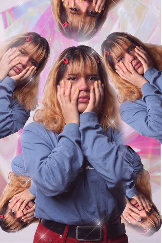
This photo is supposed to represent a dream where you are in a "heaven" like world and everything is hazy, with pops of pastels. I took inspiration from the dreams I had as a child, I would see myself wake up in an imaginative cotton candy sparkle world and I felt a feeling of comfort and happiness. The repeating patterns of Adriana is supposed to represent the curiosity I had as a child when I would have these dreams. I also placed the repeating photos in those specific spots because I also wanted to add a kaleidoscope effect to the photo. The shapes in the photo are organic and the background has reflective/ripple texture to it to add to the dream like state Adriana is in. I think the photo is balanced because of the placement of the repeating photos and it feels like a unified piece. If I were to change anything about this picture I would make Adriana have a happier expression to really emphasize the child like imagination I was trying to achieve.
Recreating Famous Photographer's Photos (3 Total)
Chrissie White

Group

Chrissie
Chrissie
|
Group
Group
|
Group Self Critique: In this project we were given an artist (Chrissie White) and had to choose 3 of their pieces to recreate. We chose three interesting still lifes. In all three there is a focal point and a main subject. The first photo has the most value as it goes from black all the way to pink, the second is balanced nicely as the fish is the main subject and the "rope"' holding it is centered. The third one utilizes the most color as our background is extremely bright and contrasts from the rest of the photos. I don't think our photos have a particularly strong message as they are still lifes, they are easy to interpret compared to more obscure photography. I think overall our group was successful in recreating Chrissie White's style, but if I had to change something I would change the lighting in the first photo because it is not perfectly lit like Chrissie White's version.
Landscape Assignment

Self Critique Landscape: This photo is a landscape I took in Julien, I liked it the most out of all the photos due to the proportion. I really liked how low and upfront the fence was compared to the hills and trees in the background. This photo has a lot of contrast because it goes from similar tones and hues of brown all the way to a bright blue. There is also a lot of texture in this photo because of the dry grass, trees, and brush. You can also see the texture of the wood in the fence. The depth of field does support the message, as its purpose is to be a landscape because of the proportions of the foreground, mid-ground, and background. This photo does not have a strong message because it is only supposed to show that I can grasp different types of photography, rather than having a themed piece. This photo was successful in relaying its message of being a landscape, but if I had to change one thing I would lower the saturation a bit.
Duotone-Soft Focus

|

|
Outdoor Strobe Shot--Model for Assignment

Kaleidoscope

|

|
